

Designing for trust: the intersection between UX and public sector accountability
Despite the public sector often lagging behind the private sector, we find ourselves shifting towards the ever-expanding digitalisation of public sector services – in part

TrustVault – Domestic abuse: Hidden in plain sight
Domestic abuse: Hidden in plain sight Domestic abuse causes often irreversible and life-long mental, psychological, and emotional damage on its victims, even decades after the

Designing for everyone: Gender parity in UX
How gender parity is improving UX In a digital age, user experience is everything. Websites, apps, and products must be designed with the user in

What is quantitative research?
What is quantitative research? We read and interpret quantitative data every day whether you read a percentage, the weight of something, or the temperature on

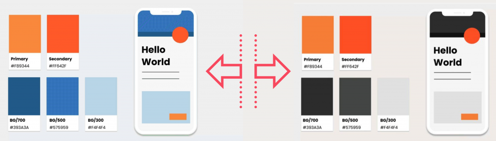
Finding your pot of gold: Harnessing the power of colour to drive conversions
FINDING YOUR POT OF GOLD: Harnessing ‘colour power’ in UX to drive conversions Colour is one of the most powerful tools in a designer’s toolkit.

ChatGPT: Friend or foe of CX in big business?
Dubbed “the best AI chatbot ever released” by the New York Times, and with the power to reach a record million users during launch week alone,